Best Practices
We’ve compiled these best practices to help you maximize our website’s design system and create beautiful, engaging content.
General Tips for Success
- Keep pages succinct and to the point.
- Include high-quality images when it’s helpful and relevant to your content. When selecting images, choose quality over quantity.
- Make your page actionable. What do you want visitors to know or do as a result of visiting this page? Include call-to-action buttons to emphasize the actions you want visitors to take.
- Even if you have HTML knowledge, please do NOT alter the HTML code in the text display. Using built-in styles is the best way to ensure we maintain a consistent, high-quality website for the long term.
Headings
Headings give structure to your page. They allow visitors (and search engines) to scan a page to determine if it’s relevant to them. Clear, specific headings are critical to SEO and accessibility. Always use headings in hierarchical order, meaning Heading 2 should be followed by Heading 3, etc. You may repeat Headings (Heading 3 followed by another Heading 3), but you may not skip levels (Heading 2 followed by Heading 5).
Design Choices
Link and Button Styles
Link Styles
Use the special link style called Gold Link in link lists to call attention to the linked item. Follow the link with a short description to allow visitors to scan information and find what they’re looking for easily.
Use the special link style called CTA Link to draw attention to an action someone can take. These have less emphasis than a button, so avoid using these for primary calls to action.
Button Colors
Gold
Gold is the primary button. It is used most often and by default for important calls to action and routing to key pages.
Example:
Blue
Where more than one button is used, combine blue and gold buttons. Use the gold button as the more important call to action.
Example:
Green
The green button should be used for stories and features only.
Do not use the green button elsewhere.
Example:
Module Guidelines
Pull Quotes
Keep quotes succinct, limiting the length to one or two sentences at most. Quotes should not exceed 50 words or they will overpower the other content on the page.

Cards
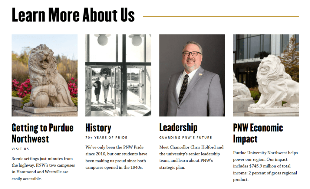
Cards are a great way to help your visitors find important information. Use cards to highlight key resources, surface important information that may be a few clicks away, or showcase a relevant page that is located in another section of the site.

Template-Specific Modules
Learn more about modules and module availability on page templates.