Power Onward Brand Guidelines
Our Purdue Northwest marks visually represent our university’s strong academic tradition and pride. By consistently communicating the visual identity of PNW, we can maintain our cohesive and distinctive university brand.

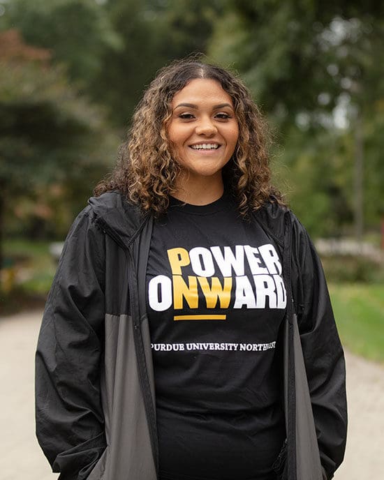
Power Onward
Each and every one of us face obstacles in life. How we deal with them makes all the difference.
At Purdue University Northwest, we go beyond the classroom, walking the extra mile with students to empower confidence and boldness to make an impact in Northwest Indiana and the world at large. To never give up, no matter the odds, pushing forward with resilience and resolve. Empowering students and faculty to ignite change and become forward-thinking leaders. PNW instills the rock-solid belief that whatever it takes, the rewards are worth it. Because inside each of us is the strength to power onward.
That’s Powering Onward

We’re all brand ambassadors for Purdue University Northwest. Branding is about much more than the proper use of logos or colors. It’s about offering a cohesive presence and tone to represent PNW. It is important to create a strong foundation and consistent identity. It’s about speaking with one voice.
The Purdue Northwest brand seeks to establish a clear, differentiating and compelling identity that activates the brand, engages its audiences and drives advancement.
Power Onward is the brand platform of Purdue Northwest that reflects the values, impact and transformational change driven by a PNW education.
How Do We Power Onward?
- PNW students are self-driven, committed to excelling in whatever path they choose, whether serving as the next generation of leaders in Northwest Indiana or bringing PNW pride to businesses and communities around the country and the world.
- PNW faculty are devoted to teaching and passionate about helping students succeed. At PNW students find mentors and a professional support structure to guide them on a path to success.
- As a premier metropolitan university, Purdue Northwest pushes beyond the boundaries of innovation to drive engagement and make an impact in Northwest Indiana and the world at large. We have set our sights on the vital future of our communities and we aim to be a positive force for change.
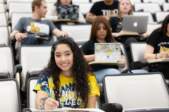
For the self-driven student looking for a path to their dreams, PNW is a premier metropolitan university that fires up the inner spirit and resilience, empowering transformational change that leads to success.
In addition to the standalone phrase “Power Onward,” there is a variation of “That’s Powering Onward” that is used in conjunction with Brand Statements.
A “Brand Statement” is a short but powerful statement relating back to a college or aspect of the university, evoking a sense of inspiration and perseverance that our students and stakeholders can empathize with.
That’s Powering Onward in Action
- Never Quitting. That’s Powering Onward.
- Pursuing Greatness. That’s Powering Onward.
- Being indispensable. That’s Powering Onward.
- Seeking challenges. That’s Powering Onward.
- Amplifying your voice. That’s Powering Onward.

Audiences
Key stakeholder audiences include:
– prospective students
– parents
– current students
– alumni
– faculty, staff and administration
– community partners and donors
Official Colors of Purdue University Northwest
Primary Palette
Black and PNW Campus Gold are the official colors for Purdue University Northwest. It is very important to match these colors faithfully when reproducing the University marks. PNW marks should be used in the full color version whenever possible. In addition to the primary palette, PNW marks also utilize white as a key support color.
Note: It is important to remember that the gold used by the department of athletics does not match the institutional gold. When using the athletics brand be sure to use PNW Athletic Gold (Pantone 7502c).
Also, for accessibility purposes, PNW’s “website gold” is hex code B1810B.
PNW Campus Gold
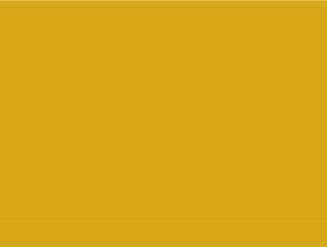
(in lieu of use *Pantone® 110C/7405U)
Process Coated: 6c 27m 100y 12k
Process Uncoated: 2c 22m 100y 12k
RGB Equivalent: 230r 177g 14b
Madeira Thread: #918-1980
Polyneon #40
Hex Code: #E6B10E
PNW Campus Black

(in lieu of use *Pantone® Black)
Process Coated: 0c 0m 0y 100k
Process Uncoated: 0c 0m 0y 100k
RGB Equivalent: 0r 0g 0b
Madeira Thread: Black
Hex Code: #000000
While the primary color palette will make up the majority of color used in materials for the university, an expanded selection of color has been provided for use in secondary elements. The secondary palette should only be used to support the primary colors.
For publications that are more complicated or have deeper levels of information, these secondary colors can help communicate content more clearly. When possible, choose colors that mimic those in adjacent photography.
For more information on the secondary color palette, please email marketing@pnw.edu.
Official Fonts
Primary Headline Typeface: Champion
Optimistic, driven and confident, Champion is a sans-serif typeface based on designs from posters promoting boxing matches. This typeface is most often used for headlines, short phrases and proofpoints. It comes in a variety of weights that may be used together in the same sentence.
Secondary Headline Typeface: Myriad Pro
With a classic yet fresh appearance, Myriad Pro should be used to communicate a broad range of subjects, especially when Champion is too strong or when a subtler or more sophisticated appearance is needed.
Introductory/Body Copy Typeface: Chaparral Pro
Sophisticated and friendly, Chaparral Pro is a serif typeface intended to balance the boldness of Champion and rigidity of Myriad. Use it for introductory copy and lengthy body copy.
Headline Substitute: Impact
Impact is acceptable when Champion is unavailable for headlines in presentations or documents. Please do not use lowercase letters from the Impact font family.
Body Copy Substitutes: Arial and Times New Roman
For the web, PowerPoint presentations and other documents, Arial may be used as a substitute for Myriad Pro, and Times New Roman may be used as a substitute for Chaparral Pro.
Where Can I Get These Fonts?
The official fonts listed above must be purchased and licensed to be used. For more information, please contact the Office of Marketing and Communications.
PNW Logos and Seal
PNW’s brand identity is summed up in the university’s official logos and seal. To properly represent and differentiate the university, it’s essential to follow official guidelines on logo sizes, placement and integrity.
Download PNW Logos
The PNW logo must be present on all university communications. These marks were designed to create a consistent brand for PNW and should not be changed or altered in any way. Having trouble downloading a logo? “Right-click” on the link, and click on “Save Link As…” or “Save Target As…”.
Vertical Format
Horizontal Format
Co-branding With Lockup
Co-branding a unit with the monogram wordmark lockup is allowed in a vertical and horizontal format. Both versions are permitted to contain up to two levels of unit structure.
To request a co-brand for your unit, email marketing@pnw.edu and include the full name of the unit(s) you want to be included within the co-brand and your intended use. In the event of a multi-sponsored initiative, a multi-unit co-brand can be requested.
Co-branding Examples
Vertically stacked co-brand for college
Vertically stacked co-brand for college and unit
Horizontally stacked co-brand for college and unit

The university brand standards provide a cohesive presence and voice to represent PNW. It is important to create a strong brand foundation and consistent identity for our students, faculty, staff and community.
Logos and icons that represent fractions of the university or do not align with the brand guidelines are confusing and may delay our students from connecting with the PNW brand.
To ensure that we are all working together to reinforce the university brand, all units should use the approved co-brand logos that represent their department or organization. Secondary graphics or logos should not be newly created, and any existing graphics should be phased out or discontinued from use.
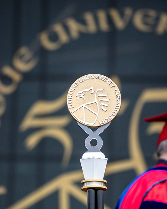 The Purdue University Northwest seal was formally adopted from the Purdue West Lafayette seal (in 2016). The seal features a griffin, the symbol of strength in medieval heraldry. The three-part shield indicates the three stated aims of the university – education, research and service. The seal should typically be used in formal and official communications, such as diplomas, letters of acceptance and communications from the Chancellor.
In addition, the seal is used on:
- Graduation banners and sashes
- Class rings and other jewelry
- Top-tier recognition plaques throughout campus
Restricted Use
Use of this mark for commercial purposes requires permission or licensure from Purdue University Northwest. For requesting such use or any questions regarding the seal, contact the PNW Office of Marketing and Communications.
Additional Brand Resources
Looking for more information? See our other brand guideline pages for more information on athletics standards, student organizations and more!
